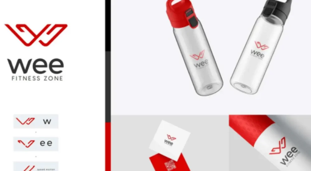
At WEE Fitness Zone, we transformed their vision into a powerful brand identity through branding, logo design, and stationary designs. Our goal was to create a look that reflects their energy, professionalism, and commitment to fitness.
Branding is more than just visuals—it’s about creating a consistent and memorable presence. Every design element was carefully crafted to ensure WEE Fitness Zone stands out in the competitive fitness industry.

Branding: A Strong, Recognizable Identity
Branding goes beyond just a logo—it’s about creating a consistent and memorable presence. For WEE Fitness Zone, we developed a brand strategy that aligns with their mission, ensuring their visual identity speaks to their target audience.
Logo Design: Strength & Motion in One Symbol
A fitness brand needs a logo that represents movement, power, and motivation. We designed a sleek, dynamic logo that embodies the essence of fitness while maintaining a modern and professional look. The color scheme and typography were carefully chosen to evoke energy and confidence.
Stationary Designs: Professionalism in Every Detail
From business cards to letterheads and envelopes, we created stationary designs that reflect WEE Fitness Zone’s identity. Every element was crafted to ensure a seamless and professional brand experience across all touchpoints.
Through our work, WEE Fitness Zone now has a cohesive and impactful brand identity that stands out in the fitness industry.
Have Any Query Feel Free Contact


